Bulletin of the Atomic Scientists
Data Visualization / 2021 January
A series of data visualizations offers a detailed look into the information that goes into setting the Doomsday Clock.
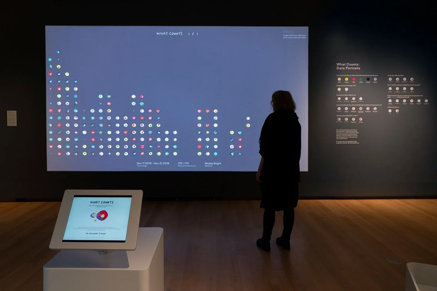
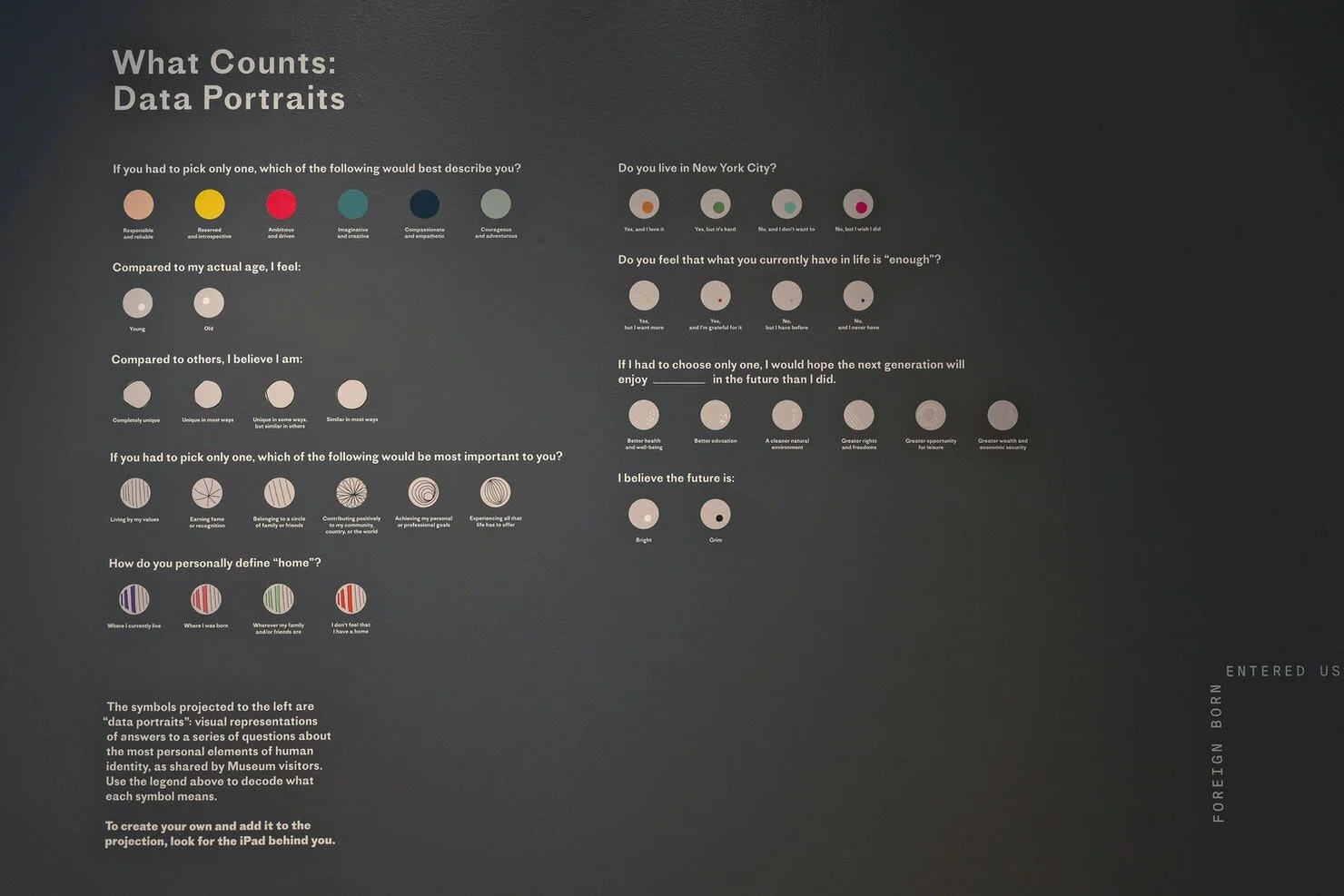
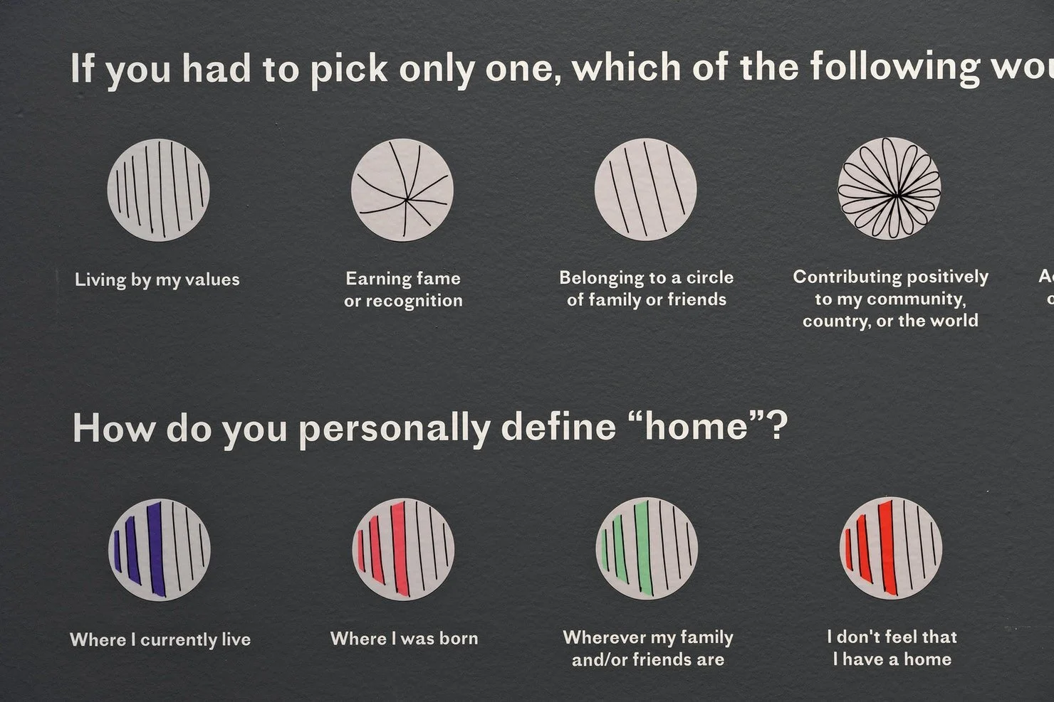
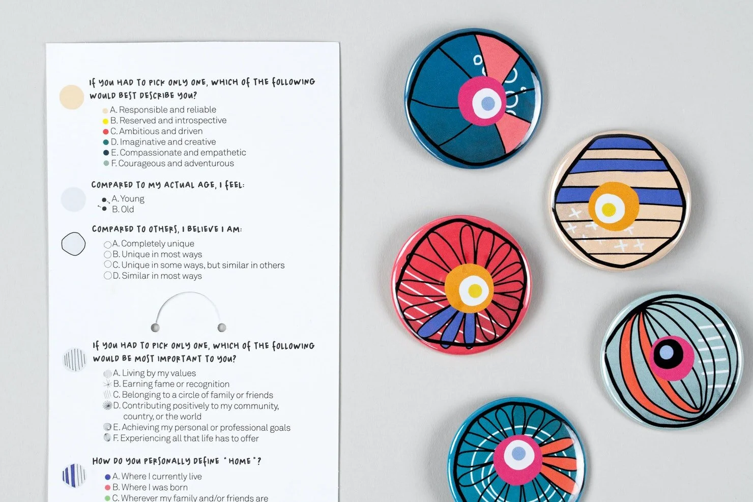
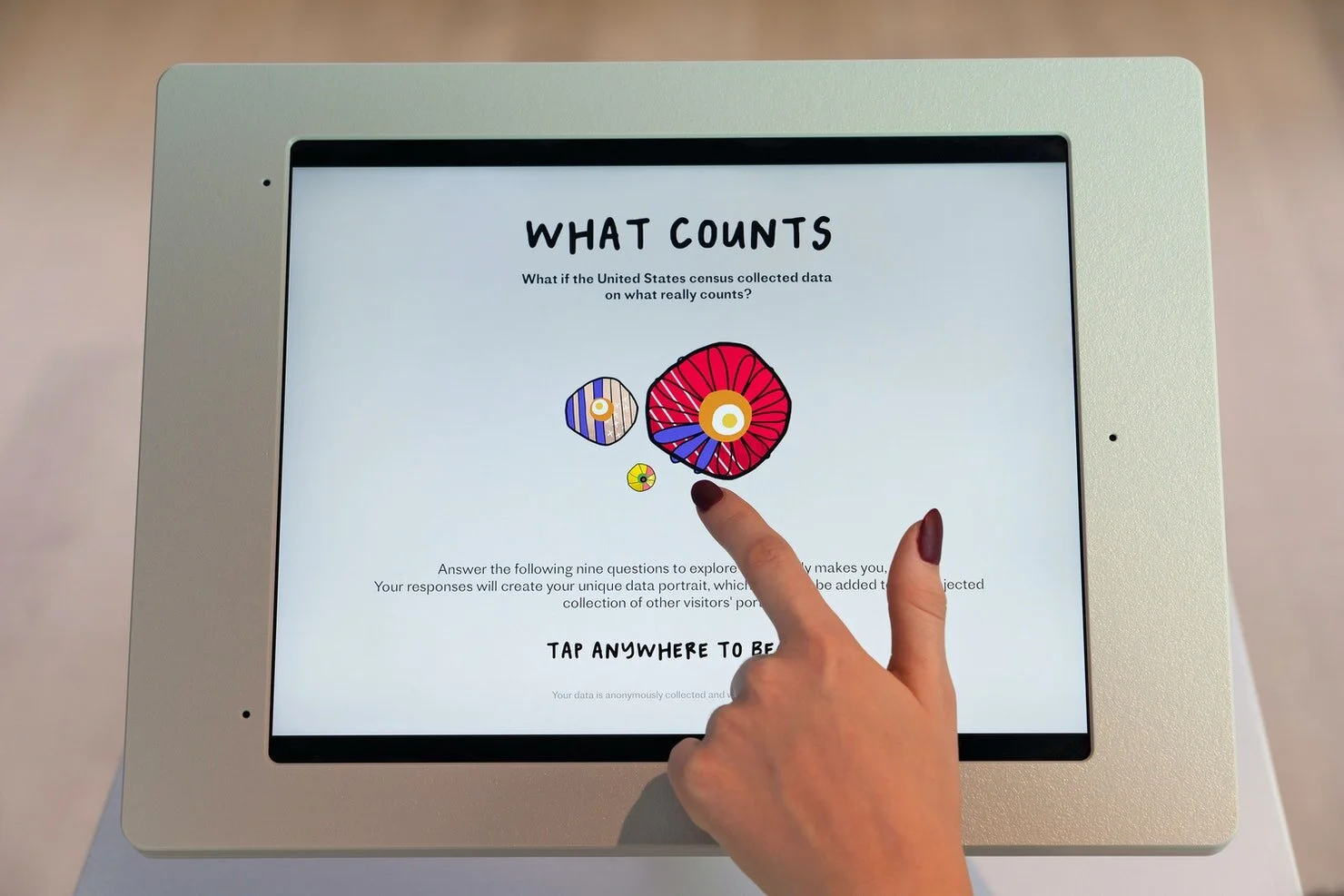
What Counts has two core components: a large projection on the gallery wall and an interactive interface installed on an iPad in the middle of the space. Exhibition visitors are encouraged to answer a short questionnaire on the iPad to contribute to the dynamic graphics projected on the gallery wall. A unique visual symbol is generated on the iPad as one moves through the survey, resulting in a layered “data portrait” that represents the visitor’s answers.
Once the survey is completed, visitors can “swipe” their unique data portrait to the gallery wall, where each portrait joins an animated projection of all data portraits collected to date.